
Visualizations and Searches
Event Search
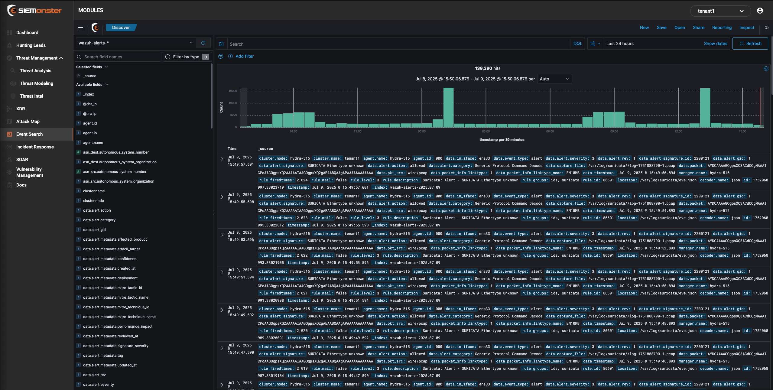
The SIEMonster Event Search is a visual webui that allows you to do realtime filtering and structuring of your ingested data. It allows for setting columns based on specific fields selection as well as filtering by DQL (Direct Query Language) or just using the “add filter option”
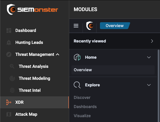
The SIEMonster XDR menu gives you full flexibility and functionality on how you want your dashboards to appear for different users. This section will provide you with a guide on how to use the dashboards and customize them to your own organizations.
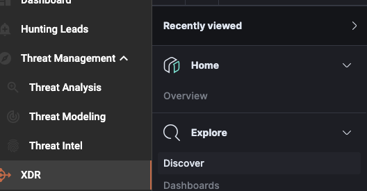
Discover
Discover allows you to explore your data with Event Search data discover functions. You have access to every document in every index that matches the selected index pattern. You can view document data, filter the search results, and submit search queries.
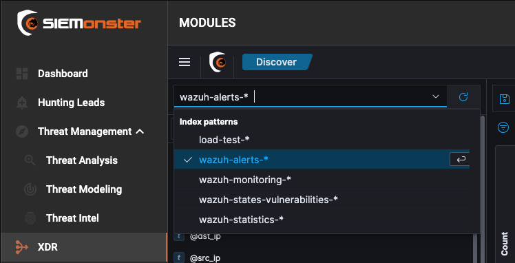
Changing the index
On the Home page, click Dashboards to access the Dashboards. Click Discover from the menu on the left and click the drop-down arrow to select the index you want to see the data from.
Time Filter
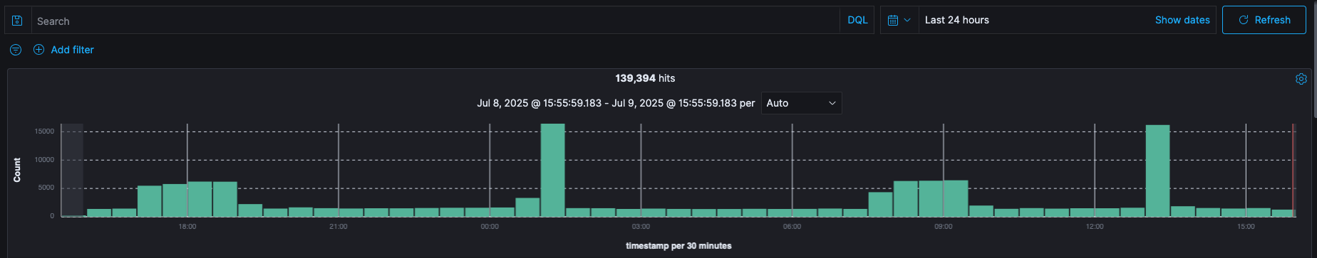
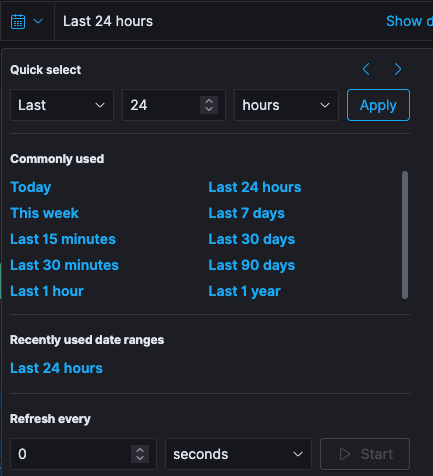
Specific time period for the search results can be defined by using the Time Picker. By default, the time range is set to the This month. However, the time picker can be used to change the default time period.

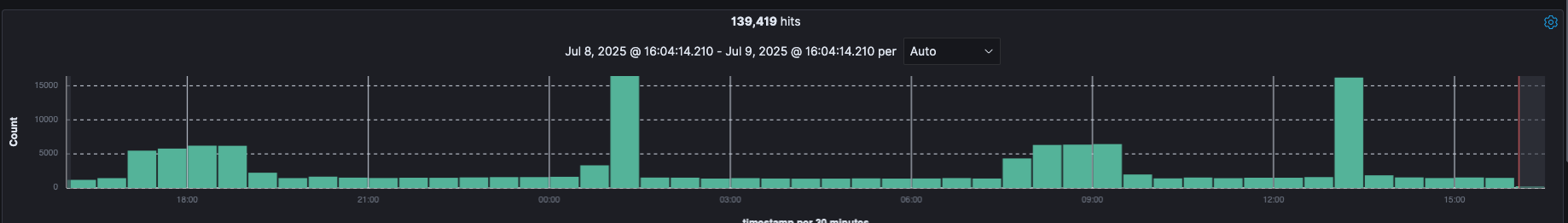
Histogram
After you selected a time range that contains data, you will see a histogram at the top of the page, that will show the distribution of events over time.
The time you select will automatically be applied to any page you visit including the Dashboard and Visualize. However, this behavior can be changed at individual page level.
Auto refresh rate can be setup to select a refresh interval from the list. This can periodically resubmit your searches to retrieve the latest results.
🔖 If auto refresh is disabled, click the Refresh button to manually refresh the visualizations.
Searches can be Saved and then used later by clicking the Open button.
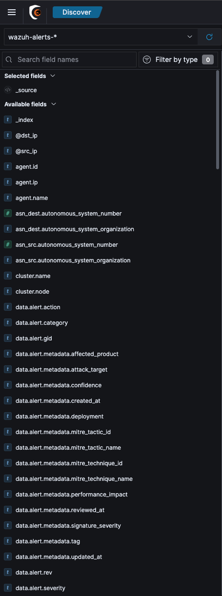
Fields
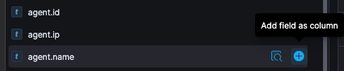
All the Available fields with their data types are available on the left side of the page. If you hover-over any field, you can click add to add that field as a column to the table on the right and it will then show the contents of this field.
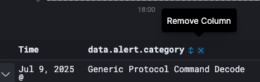
Once added, hover-over the field that you want to remove and click Remove column.
Adding Filter for Documents
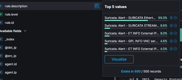
Documents can be filtered in the search results to display specific fields. Negative filters can be added to exclude documents that contain the specific field value. The applied filters are shown below the Query bar. Negative filters are shown in red.
To add a filter from the list of fields available:
Click on the name of the field you want to filter on under Available fields. This will display the top five values for that field.
Click on the

icon to add a positive filter and click on the

icon to add a negative filter. This will then either include or exclude only those documents that contain the value in the field.
To add a filter from the documents table:
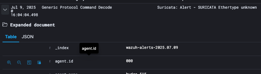
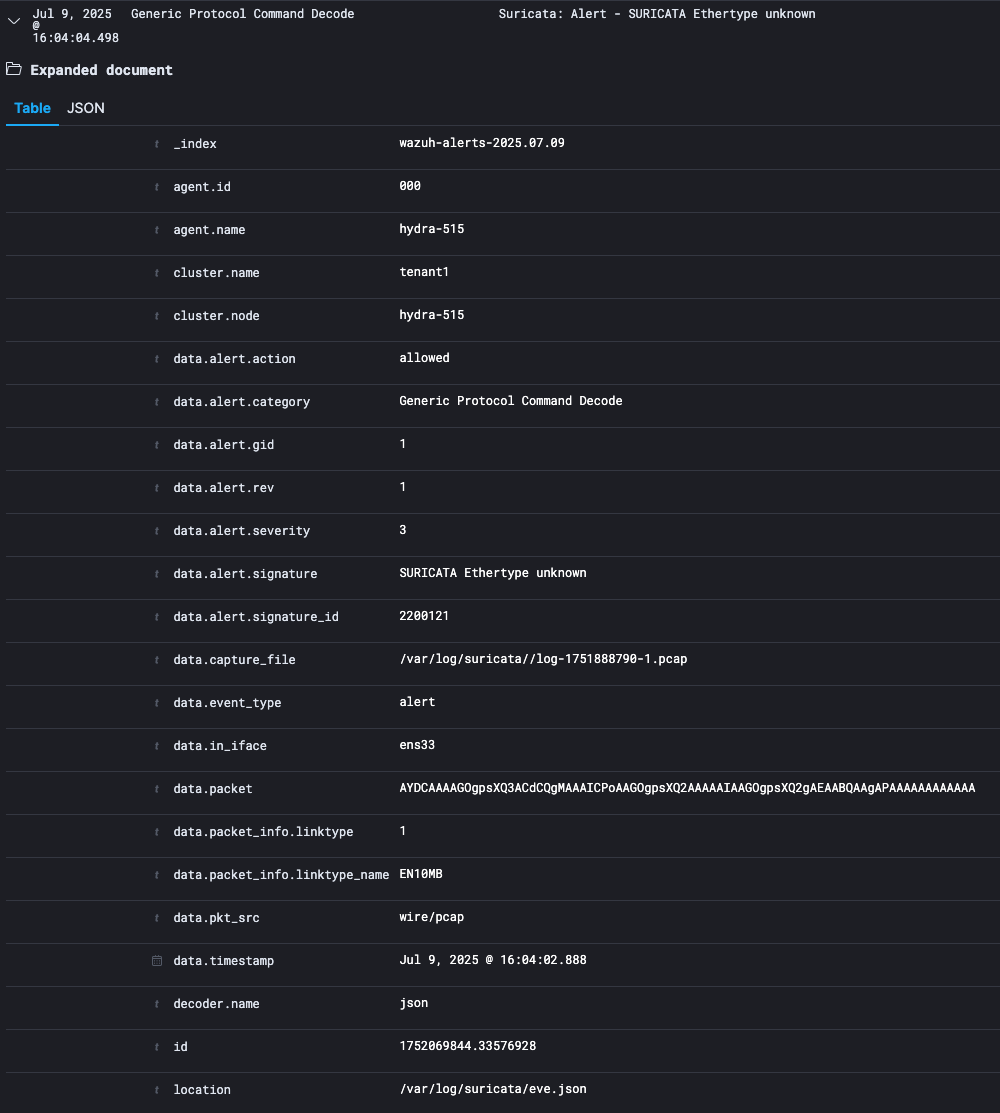
Expand the document by clicking the expand button

Click on the
icon to add a positive filter and click on the
icon to add a negative filter on the right of the field name. This will then either include or exclude only those documents that contain the value in the field.
click on the

icon on the right of the field name to filter on whether documents contain the field.
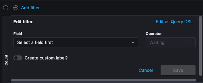
To add a filter manually:
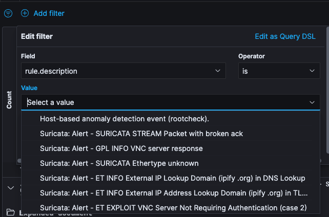
Click Add filter. From the Fields drop-down menu, select the field you would like to filter on.
Set the Operators filter as is and from the Values drop-drop menu, select the value you are filtering for.
If you enable the toggle for a customer label, in the Label field, type specify what you want the label to be and click Save.
If you hover-over the filter that you just created, you will have an option to Remove filter.
Search for Documents
To search and filter the documents shown in the list, you can use the large search box at the top of the page. The search box accepts query strings in a special syntax.
If you want to search content in any field, just type in the content that you want to search. Entering the value you are searching for in the search box and pressing enter will show you only events that contain the term you specified.

The query language allows some fine-grained search queries, like:
Search Term | Description |
lang:en | To search inside a field named “lang” |
lang:e? | Wildcard expressions |
lang:(en OR es) | OR queries on fields |
user.listed_count:[0 TO 10] | Range search on numeric fields |
Exercise: Discover the Data
Discover allows you to explore the incoming data with Kibana’s data discovery functions. You can submit search queries, filter the search results, and view document data. You can also see the number of documents that match the search query and get field value statistics.
On the Home page, click Dashboards to access the Dashboard.
To display the incoming raw data, click the three bar

menu and then click Discover. The report’s data is selected by clicking on the calendar dropdown and selecting the desired date range, for the purpose of this exercise select last 1 hour.
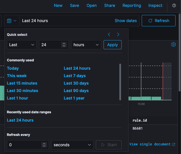
🔖 In the time range tool, there are different ways to select the date range, you can select the date from the Commonly used menu with pre-set relative periods of time (for example Year to date, This month), or Recently used data ranges
The histogram at the top of the page shows the distribution of documents over the time range selected.
Expand one of the events to view the list of data fields used in that event. Queries are based on these fields.
By default, the table shows the localized version of the time field that’s configured for the selected index pattern. You can toggle on or off different event fields if you hover over the field and click add.
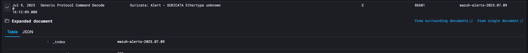
In some business scenarios, it is helpful to view all the documents related to a specific event. To show the context related to the document, expand one of the events and click View surrounding documents.
Search results can also be filtered to view those documents that contain value in a filter. Click + Add filter to add a filter manually.
Click Save to save these results. In the Title field, type Rule Overview. Click Confirm Save.
Visualize
Visualizations are used to aggregate and visualize your data in your Elasticsearch indices in different ways. Kibana visualizations are based on Elasticsearch queries.
By using a series of Elasticsearch aggregations to extract and process your data, you can create a Dashboard with charts that shows the trends, spikes, and dips. Visualizations can be based on the searches saved from Discover, or you can start with a new search query.
The next section introduces the concept of Elasticsearch Aggregations as they are the basis of visualization.
Aggregations
The aggregation of the data in SIEMonster is not done by Kibana, but by the underlying Elasticsearch. The aggregation framework provides data based on a search query and it can build analytic information over a set of documents.
There are different types of aggregations, each with its own purpose. Aggregation can be categorized into four types:
Bucket Aggregation
Metric Aggregation
Matric Aggregation
Pipeline Aggregation
Bucket Aggregation
A bucket aggregation, groups all documents into several buckets, each containing a subset of the indexed documents and associated with a key. The decision which bucket to sort a specific document into can be based on the value of a specific field, a custom filter, or other parameters.
Currently, Kibana 5 supports the following 7 bucket aggregations:
Date Histogram
The Date Histogram aggregation requires a field of type date and an interval. It can only be used with the date values. It will then put all the documents into one bucket, whose value of the specified date field lies within the same interval.
Example:
You can construct a Date Histogram on @timestamp field of all messages with the interval minute. In this case, there will be a bucket for each minute and each bucket will hold all messages that have been written in that minute.
Besides common interval values like minutes, hourly, daily, etc. there is the special value auto. When you select auto interval, the actual time interval will be determined by Kibana depending on how large you want to draw this graph, so that a respectable number of buckets will be created (not too many to pollute the graph, nor too few so the graph would become irrelevant).
Histogram
A Histogram is like Date Histogram, but unlike Date Histogram, Histogram can be applied on number fields extracted from the documents. It dynamically builds fixed sized buckets over the values.
Range
The range aggregation is like a manual Histogram aggregation. You need to specify a field of type number, but you must also specify each interval manually. This is useful if you either want differently sized intervals or intervals that overlap.
Whenever you enter Range in Event Search, you can leave the upper or lower bound empty to create an open range (like the above 1000-*).
🔖 This aggregation includes the from value and excludes the to value for each range
Terms
Terms aggregation creates buckets by the values of a field. It is very similar to a classical SQL GROUP BY. You need to specify a field (which can be of any type), it will create a bucket for each of the values that exist in that field and add all documents in that field with a value.
Example:
You can run a Terms aggregation on the field geoip.country_name that holds the country name. It will then have a bucket for each country and in each bucket the documents of all events from that country.
The aggregation doesn’t always need to match the whole field value. If you let Elasticsearch analyze a string field, it will by default split its value up by spaces, punctuation marks and the like, and each part will be an own term, and as such would get an own bucket.
If you use a Term aggregation on a rule, you might assume that you would get nearly one bucket per event, because two messages rarely are the same. But this field is analyzed in our sample data, so you would get buckets for ssh, syslog, failure and so on and in each of these buckets all documents, that had that Term in the text field (even though it doesn’t need to match the text field exactly).
Elasticsearch can be configured not to analyze fields or you can configure the analyzer that is used to match the behavior of a Terms aggregation to your actual needs. For example, you could let the text field be analyzed so that colons (:) and slashes (/) won’t be split separators. That way, an URL would be a single term and not split up into http, the domain, the ending and so on.
Filters
Filters is a completely flexible (and at times slower than the others) aggregation. You need to specify Filters for each bucket that will collect all documents that match its associated filter.
Example:
Create a Filter aggregation with one query being geoip.country_name:(Ukraine or China) and the second filter being rule.firedtimes:[100 TO *].
Aggregation will create two buckets, one containing all the events from Ukraine or China, and one bucket with all the events with 100 or more rule fired times. It is up to you, to decide what kind of analysis you would do with these two buckets.
Significant Terms
The Significant Terms aggregation can be used to find uncommonly common terms in a set of documents. Given a subset of documents, this aggregation finds all the terms which appear in this subset more often than could be expected from term occurrences in the whole document set.
It then builds a bucket for each of the Significant Terms that contains all documents of the subset in which this term appears. The size parameter controls how many buckets are constructed, for example how many Significant Terms are calculated.
The subset on which to operate the Significant Terms aggregation can be constructed by a filter or you can use another bucket aggregation first on all documents and then choose Significant Terms as a sub-aggregation which is computed for the documents in each bucket.
Example:
You can use the search field at the top to filter our documents for those with geoip.country_name:China and then select significant terms as a bucket aggregation.
🔖 In order to deliver relevant results that really give insight into trends and anomalies in your data, the Significant Terms aggregation needs sufficiently sized subsets of documents to work on
GeoHash Grid
Elasticsearch can store coordinates in a special type geo_point field and group points into buckets that represent cells in a grid. Geohash aggregation can create buckets for values close to each other. You must specify a field of type geo_point and a precision. The smaller the precision, the larger area the buckets will cover.
Example:
You can create a Geohash aggregation on the coordinates field in the event data. This will create a bucket containing events close to each other. Precision can specify how close events can be and how many buckets are needed for the data.
🔖 Geohash aggregation works better with a Tile Map visualization (covered later)
Metric Aggregations
After you have run a bucket aggregation on your data, you will have several buckets with documents in them. You can now specify one Metric Aggregation to calculate a single value for each bucket. The metric aggregation will be run on every bucket and result in one value per bucket.
The aggregations in this family compute metrics based on values extracted in one way or another from the documents that are being aggregated, they can also be generated using scripts.
In the visualizations the bucket aggregation usually will be used to determine the "first dimension" of the chart (e.g. for a pie chart, each bucket is one pie slice; for a bar chart each bucket will get its own bar). The value calculated by the metric aggregation will then be displayed as the "second dimension" (e.g. for a pie chart, the percentage it has in the whole pie; for a bar chart the actual high of the bar on the y-axis).
Since Metric Aggregations mostly makes sense, when they run on buckets, the examples of Metric Aggregations will always contain a bucket aggregation as a sample too. But of course, you could also use the Metric Aggregation on any other bucket aggregation; a bucket stays a bucket.
Count
This is not really an aggregation. It returns the number of documents that are in each bucket as a value for that bucket.
Example:
To calculate the number of events from a specific country, you can use a term aggregation on the field geoip.country_name (which will create one bucket per country code) and afterwards run a count metric aggregation. Every country bucket will have the number of events as a result.
Average/Sum
For the Average and Sum aggregations you need to specify a numeric field. The result for each bucket will be the sum of all values in that field or the average of all values in that field respectively.
Example:
You can have the same country buckets as above again and use an Average aggregation on the rule fired times count field to get a result of how many rules fired times events in that country have in average.
Max/Min
Like the Average and Sum aggregation, this aggregation needs a numeric field to run on. It will return the Minimum value or Maximum value that can be found in any document in the bucket for that field.
Example: If we use the country buckets and run a Maximum aggregation on the rule fired times, we would get for each country the highest amount of rule triggers an event had in the selected time period.
Unique Count
The Unique count will require a field and counts how many unique values exist in documents for that bucket.
Example:
This time we will use range buckets on the rule.firedtimes field, meaning we will have buckets for users with 1-50, 50-100 and 100- rule fired times.
If we now run a Unique Count aggregation on the geoip.country_name field, we will get for each rule fired times range the number of how many different countries users with so many rule fired times would come.
In the sample data that would show us, that there are attackers from 8 different countries with 1 to 50 rule fired times, from 30 for 50 to 100 rule fired times and from 4 different countries for 100+ rule fired times and above.
Percentiles
A Percentiles aggregation is a bit different, since it does not result in one value for each bucket, but in multiple values per bucket. These can be shown as different colored lines in a line graph.
When specifying a Percentile aggregation, you must specify a number value field and multiple percentage values. The result of the aggregation will be the value for which the specified percentage of documents will be inside (lower) as this value.
Example:
You specify a Percentiles aggregation on the field user.rule fired times_count and specify the percentile values 1, 50 and 99. This will result in three aggregated values for each bucket.
Let’s assume that we have just one bucket with events in it:
The 1 percentile result (and e.g. the line in a line graph) will have the value 7. This means that 1% of all the events in this bucket have a rule fired times count with 7 or below.
The 50-percentile result is 276, meaning that 50% of all the events in this bucket have a rule fired times count of 276 or below.
The 99 percentile have a value of 17000, meaning that 99% of the events in the bucket have a rule fired times count of 17000 or below.
Visualizations
The SIEMonster Kibana creates visualization of the data in the Elasticsearch queries that can then be used to build Dashboards that display related visualization.
There are different types of visualizations available:
Chart Type | Description |
Area, Line, Bar Charts | Compares different series in X/Y charts |
Data Table | Displays a table of aggregated data |
Markdown Widget | A simple widget, that can display some markdown text. Can be used to add help boxes or links to dashboards |
Metric | Displays one the result of a metric aggregation without buckets as a single large number |
Pie Chart | Displays data as a pie with different slices for each bucket or as a donut |
Tile Map | Displays a map for results of a geohash aggregation |
Vertical Bar Chart | A chart with vertical bars for each bucket. |
Saving and Loading
Saving visualizations allow you to refresh them in Visualize and use them in Dashboards. While editing a visualization you will see the same Save, Share and Refresh icons beside the search bar.
Event Search always take you back to the same visualization that you are working on while navigating between different tabs and the Visualize tab.
As a good practice, you should always save your visualization so that you do not lose it.
🔖 You can import, export, edit, or delete saved visualizations from Management/Saved Objects
Creating a Visualization
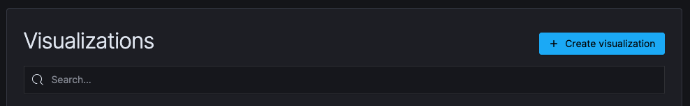
When you click on Visualize in the side navigation, it will present you with a list of all the saved visualizations that can be edited and an option for you to create a new visualization.
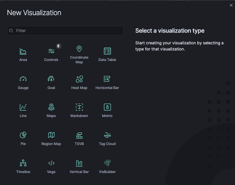
When you click on the “+ Create Visualization” button, you will need to select the visualization type, and then specify either of the following search query to retrieve the data for your visualization.
Click the name of the Saved Search you want to use to build a visualization from the saved search.
To define a new search criterion, select from the From a New Gauge, the Index that contain the data you want to visualize. This will open the visualization builder.
Choose the Metric Aggregation (for example Count, Sum, Top Hit, Unique Count) for the visualization’s Y-axis, and select the Bucket Aggregation (for example Histogram, Filters, Range, Significant Terms) for the X-axis.
Visualization Types
In the following section, all the visualizations are described in detail with some examples. The order is not alphabetically, but an order that should be more intuitive to understand the visualizations. All are based on the Wazuh/OSSEC alerts index. A lot of the logic that applies to all charts will be explained in the Pie Charts section, so you should read this one before the others.
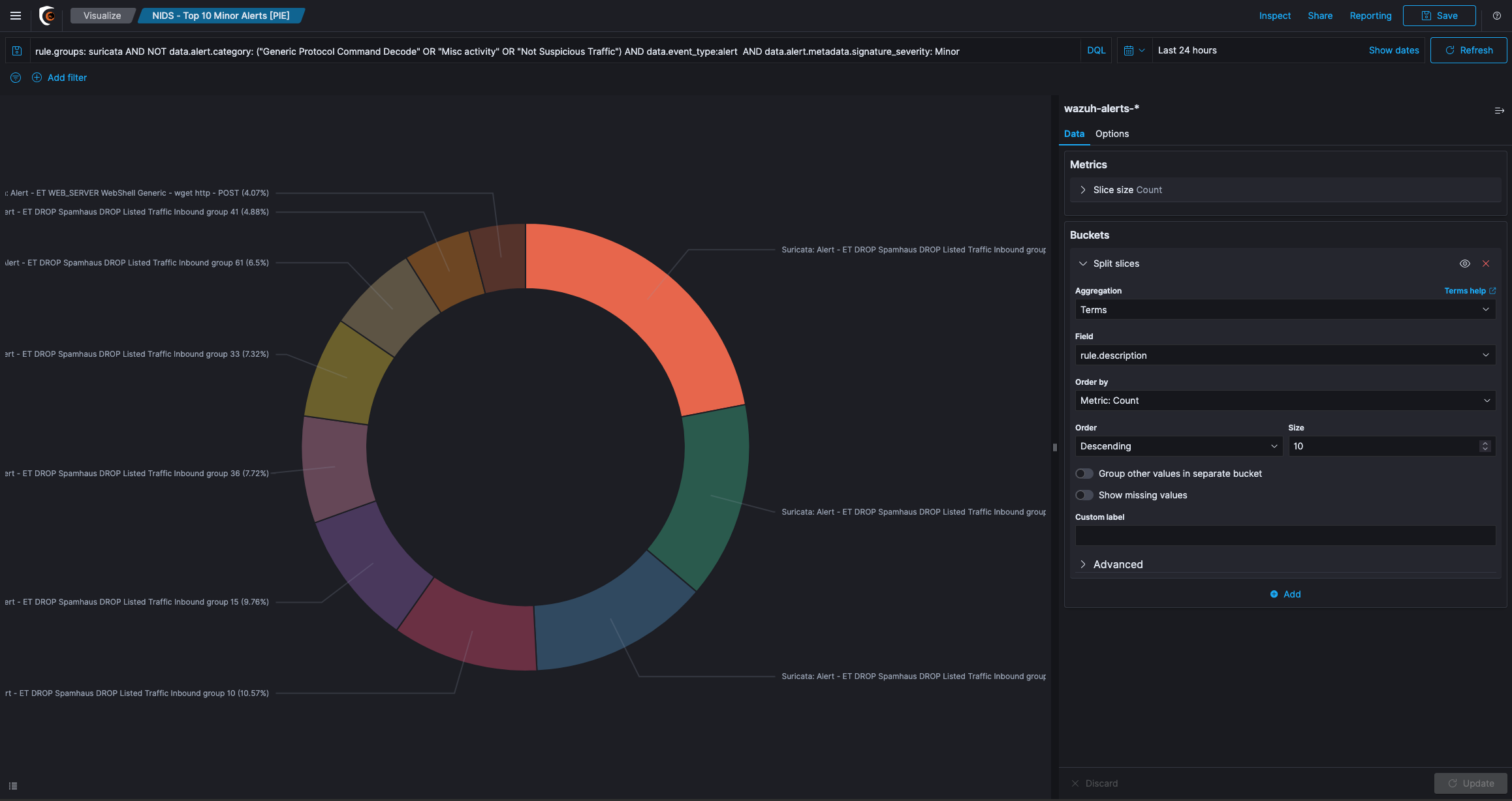
Pie chart
Pie chart is one of the visualization types, it displays data as a pie with different slices for each bucket. Metric aggregation determines the slice size of a Pie Chart.
Once you select the Pie Chart, wazuh-alerts is used as a source in this example. This example has a preview of your visualization on the right, and the edit options in the side navigation on the left.
Visualization Editor for a Pie Chart
There are two icons on the top right of the panel of the Data tab.
Apply changes is a play icon and Discard changes a cancel cross beside it.
If you make changes in the editor, you must click Apply changes to view the changes in the preview on the right side or press Discard changes to cancel changes and reset the panel.
The Donut checkbox under the Options tab can be used to specify whether the diagram should be displayed as a donut instead of a pie.
Show Tooltip exist on most of the visualizations and allows you enable or disable tooltips on the chart. When it is enabled, you can hover over a slice of the pie chart (or bar in a Bar Chart etc.), a tooltip will display detailed data about that slice, for example what field and value the chart belongs to and the value that the metrics aggregation calculated.
Aggregations
The slice size of a pie chart is determined by the Metrics aggregation. click on the
icon from the Data tab and select Count from the Aggregation drop-down menu.
The Count aggregations returns a raw count of the elements in the wazuh-alerts index pattern. Enter a label in the Custom Label field to change the display label.
The buckets aggregations determine what information is being retrieved from your data set. Before you select a bucket aggregation, you can specify if you are splitting slices within a single chart or splitting into multiple charts.
Split Chart is a commonly used visualization option. In a Split Chart, each bucket created by the bucket aggregation gets an own chart. All the charts will be placed beside and below each other and make up the whole visualization. Split Slices is another visualization option that can generate a slice for each bucket.
Example:
Kibana requires aggregation and its parameters to add a Split Slice type.
Expand Split Slices by clicking on the “+ Add” icon
Select Terms from the Aggregation drop-down menu
Select rule.level from the Field drop-down menu
Click on the Update icon
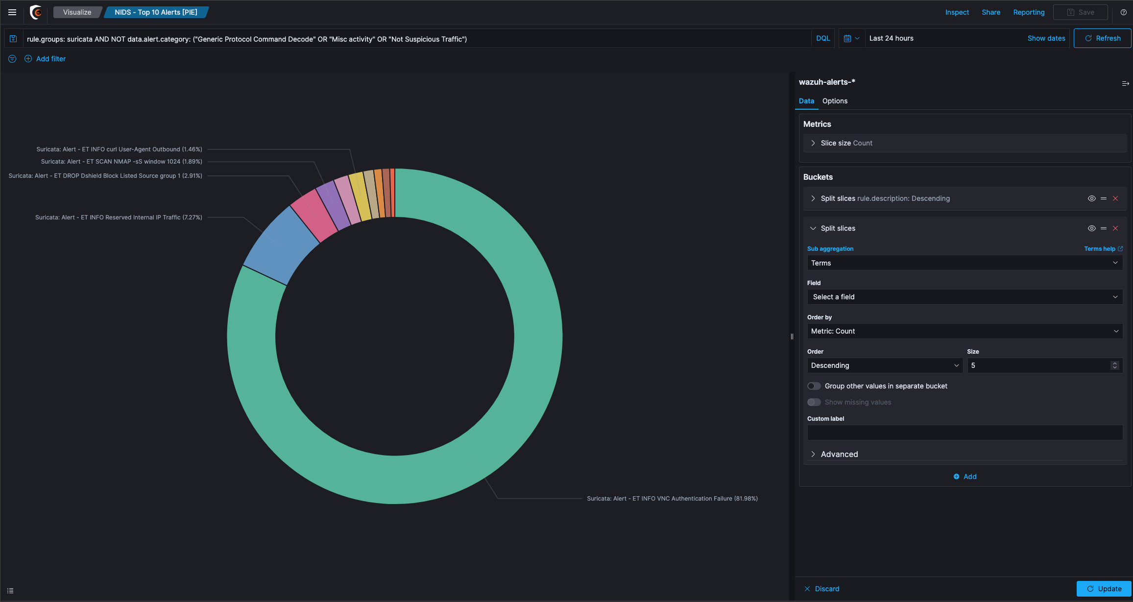
The result above shows that there is one pie slice per bucket (for example per rule level).
Question: How is the size of the slice in the pie determined?
Answer: This will be done by the Metric aggregation, which by default is set to Count of documents. So, the pie now shows one slice per rule.level bucket and its percentage depends on the number of events, that came from this event.
Question: Pie chart with a sum Metric aggregation across the ruled count but, why are there only shown two slices?
Answer: This is determined by the Order and Size option in the Bucket aggregation. You can specify how many buckets you want to see in the chart, and if you would like to see the ones with the least (bottom) or the highest (top) values.
This order and size are linked to the Metric aggregation on the top. To demonstrate this, switch the Metric aggregation on the top. When you expand it, you can switch the type to Sum and the field to rule.firedtimes. You will now get a slice for each level and its size will be determined, by the sum of the triggers per rule, that fired in our time range.
By using the Size option, you can restrict results to only show the top results.
With the Order by drop-down menu, you can also specify another Metrics aggregation, that you want to use for ordering. Some graph types support multiple Metric aggregations. If you add multiple Metrics aggregations, you will also be able to select in the order by box, which of these you want to use for ordering.
The Order settings depend on the metric aggregation, that you have selected at the top of the editor.
Nested aggregations on a Pie Chart
A Pie Chart can use nested bucketing. You can click the Add sub-buckets button to add another level of bucketing. You cannot use a different visualization type in a sub bucket. For example, you cannot add Split Chart in a Splice Slice type of visualization because it splits charts first and then use the sub aggregation on each chart.
Adding a sub aggregation of type Split Slices will create a second ring of slices around the first ring.
Kibana in this scenario first aggregates via a Terms aggregation on the country code field, so you have one bucket for each country code with all the events from that country in it. These buckets are shown as the inner pie and their size is determined by the selected metric aggregation (Count of documents in each bucket).
Inside each bucket Kibana now use the nested aggregation to group by the rule.firedtimes count in a thousand interval. The result will be a bucket for each country code and inside each of these buckets, are buckets for each rule fired interval.
The size of the inside buckets is again determined by the selected Metric aggregation, meaning also the size of documents will be counted. In the Pie chart you will see this nested aggregation as there are more slices in the second ring.
If you want to change the bucketing order, meaning in this case, you first want to bucket the events by their rule.firedtimes and then you want to have buckets inside these follower buckets for each country, you can just use the arrows beside the aggregation to move it to an outer or inner level.
There are some options to the Histogram aggregation. You can set if empty buckets (buckets in which interval no documents lie) should be shown. This does not make any sense for Pie charts, since they will just appear in the legend, but due to the nature of the Pie chart, their slice will be 0% large, so you cannot see it. You can also set a limit for the minimum and maximum field value, that you want to use.
Click on the Save button on the top right and give your visualization a name.
Coordinate Map
A Coordinate map is most likely the only useful way to display a Geohash aggregation. When you create a new coordinate map, you can use the Split Chart to create one map per bucket and use type as Geo Coordinates.
That way you must select a field that contains geo coordinates and a precision. The visualization will show a circle on the map for each bucket. The circle (and bucket) size depends on the precision you choose. The color of the circle will indicate the actual value calculated by the Metric aggregation.
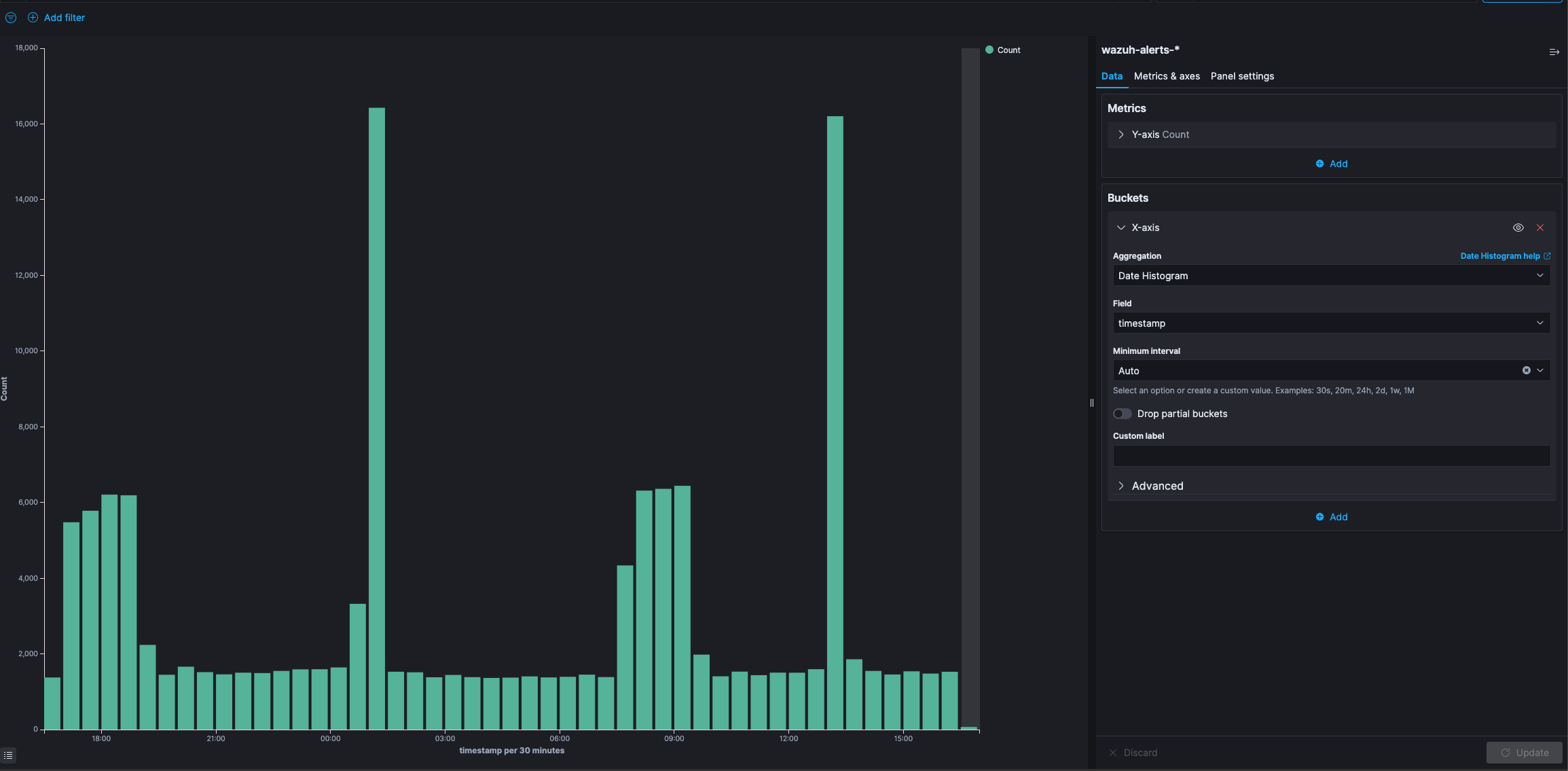
Area and Line Charts
Both Area and Line charts are very similar, they are used to display data over time and allow you to plot your data on X and Y axis. Area chart paints the area below the line, and it supports different methods of overlapping and stacking for the different area.
The chart that we want to create, should compare HIDS rule levels greater than 9 with attack signatures. We want to split up the graph for the two options.
Area Chart with Split Chart Aggregation
Add a new bucket aggregation with type Split Chart with a Filters aggregation and one filter for rule.level: >9 and another for rule.groups: attack. The X-axis is often used to display a time value (so data will be displayed over time), but it is not limited to that. You can use any other aggregation. however, the line (or area) will be interpolated between two points on the X-axis. This will not make much sense, if the values you choose are not consecutive.
Add another sub aggregation of type Split Area that can create multiple colored areas in the chart. To add geo positions, you need to add Terms aggregation on the field geoip.country_name.raw. Now you have charts showing the events by country.
In the Metric and Axes options you can change the Chart Mode that is currently set to stacked. This option only applies to the Area chart, since in a Line chart there is no need for stacking or overlapping areas.
There are five different types of modes for the area charts:
Stacked: Stacks the aggregations on top of each other
Overlap: The aggregations overlap, with translucency indicating areas of overlap
Wiggle: Displays the aggregations as a streamgraph
Percentage: Displays each aggregation as a proportion of the total
Silhouette: Displays each aggregation as variance from a central line
The following behaviors can be enabled or disabled:
Smooth Lines: Tick this box to curve the top boundary of the area from point to point
Set Y-Axis Extents: Tick this box and enter values in the y-max and y-min fields to set the Y-axis to specific values.
Scale Y-Axis to Data Bounds: The default Y-axis bounds are zero and the maximum value returned in the data. Tick this box to change both upper and lower bounds to match the values returned in the data
Order buckets by descending sum: Tick this box to enforce sorting of buckets by descending sum in the visualization
Show Tooltip: Tick this box to enable the display of tooltips
Stacked
The area for each bucket will be stacked upon the area below. The total documents across all buckets can be directly seen from the height of all stacked elements.
Stacked mode of Area chart
Overlap
In the Overlap view, areas are not stacked upon each other. Every area will begin at the X-axis and will be displayed semi-transparent, so all areas overlap each other. You can easily compare the values of the different buckets against each other that way, but it is harder to get the total value of all buckets in that mode.
Overlap mode of Area chart
Percentage
The height of the chart will always be 100% for the whole X-axis and only the percentage between the different buckets will be shown.
Percentage mode of Area chart
Silhouette
In this chart mode, a line somewhere in the middle of the diagram is chosen and all charts evolve from that line to both directions.
Wiggle
Wiggle is like the Silhouette mode, but it does not keep a static baseline from which the areas evolve in both directions. Instead it tries to calculate the baseline for each value again, so that change in slope is minimized. It makes seeing relations between area sizes and reading the total value more difficult than the other modes.
Wiggle mode in Area chart
Multiple Y-axis
Beside changing the view mode, you can also add another Metric aggregation to either Line or area charts. That Metric aggregation will be shown with its own color in the same chart. Unfortunately, all Metric aggregations you add, will share the same scale on the Y-axis. That is why it makes most sense if your Metric aggregations return values in the same dimension (For example one metric that will result in values from up to 100 and another that result in values from 1 million to 10 million, will not be displayed very well, since the first metric will barely be visible in the graph).
Vertical Bar
A Bar Chart Example
The vertical bar visualization is much like the area visualization, but more suited if the data on your X-axis is not consecutive, because each X-axis value will get its own bar(s) and there won’t be any interpolation done between the values of these bars.
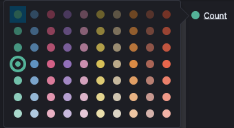
Changing Bar Colors
To the right of the visualization the colors for each filter/query can be changed by expanding the filter and picking the required color.
You only have three bar modes available:
Stacked: Behaves the same like in area chart, it just stacks the bars onto each other
Percentage: Uses 100% height bars, and only shows the distribution between the different buckets
Grouped: It is the only different mode compared to Area charts. It will place the bars for each X-axis value beside each other
Metric
A Metric visualization can just display the result of a Metrics aggregation. There is no bucketing done. It will always apply to the whole data set, that is currently considered (you can change the data set by typing queries in the top box). The only view option, that exists is the font size of the displayed number.
Markdown Widget
This is a very simple widget, which does not do anything with your data. You only have the view options where you can specify some markdown. The markdown will be rendered in the visualization. This can be very useful to add help texts or links to other pages to your dashboards. The markdown you can enter is GitHub flavored markdown.
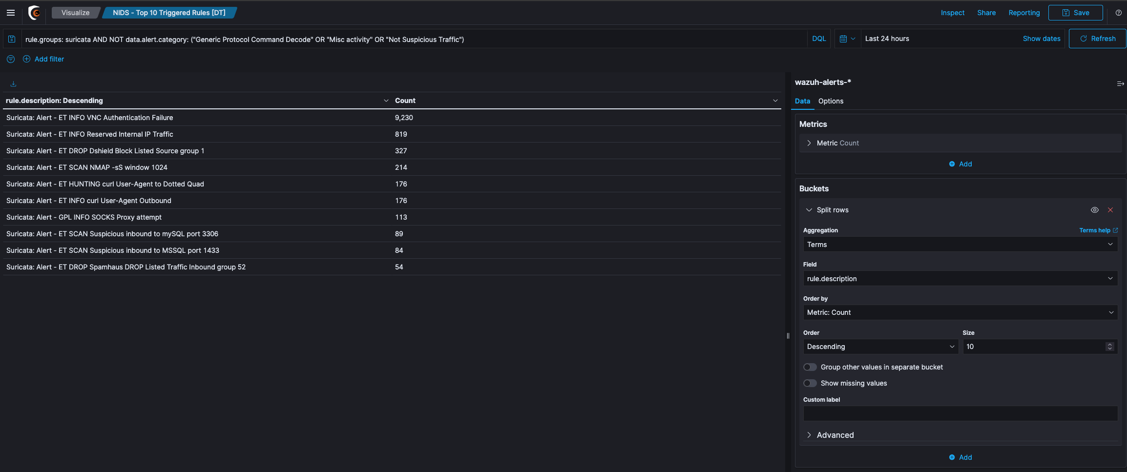
Data Table
A Data Table is a tabular output of aggregation results. It is basically the raw data, that in other visualizations would be rendered into some graphs.
Data Table Example
Let’s create a table that uses the Split Rows type to aggregate the top 5 countries. and a sub aggregation with some ranges on the rule level field. In the screenshot above, you can see what the aggregations should look like and the result of the table.
We will get all the country buckets on the top level. They will be presented in the first column of the table. Since each of these rule level buckets contains multiple buckets for the rule levels nested aggregation, there are 2 rows for each country, i.e. there is one row with the country in the front for every bucket in the nested aggregation. The first two rows are both for United States, and each row for one sub bucket of the nested aggregation. The result of the metrics aggregation will be shown in the last column. If you add another nested aggregation you will see, that those tables easily get large and confusing.
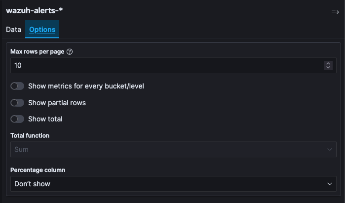
If you would now like to see the result of the Metrics aggregation for the Terms aggregation on the countries, you would have to sum up all the values in the last column, that belongs to rows beginning with United States. This is some work to do and would not work very well for average metrics aggregations for example. In the view options you can enable Show metrics for every bucket/level, which will show the result of the metrics aggregation after every column, for that level of aggregation. If you switch it on, after the United States column should appear another column, that says 3989, meaning there are 3989 documents in the United States bucket. This will be shown in every row, though it will always be the same for all rows with United States in it. You can also set the size of how many rows should be shown in one page of the table in the view options.
Queries in Visualizations
Queries can be entered in a specific query language in a search box at the top of the page. It also works for visualizations. You can just enter any query and it will use this as a filter on the data, before the aggregation runs on the data.
Enter “anomaly” in the search box and press enter. You will see only those panes that relate to anomaly.
This filtering is very useful, because it will be stored with the visualization when you save it, meaning if you place the visualization on a dashboard the query that you stored with the visualization will still be applied.
Debugging Visualizations
Kibana offers you with some debugging output for your visualizations. If you are on Visualize page, you can see a small up pointing arrow below the visualization preview (you will also see this on dashboards below the visualizations). Hitting this will reveal the debug panel with several tabs on the top.
Table
Table show the results of the aggregation as a data table visualization. It is the raw data the way Kibana views it.
Request
The request tab shows the raw JSON of the request, that has been sent to Elasticsearch for this aggregation.
Response
Shows the raw JSON response body, that Elasticsearch returned to the request.
Statistics
Shows statistics about the call, like the duration of the request and the query, the number of documents that were hit, and the index that was queried.
Exercise: Visualize the Data
The SIEMonster Kibana creates visualization of the data in the Elasticsearch queries that can then be used to build Dashboards to display related visualization.
Click on Visualize from the side navigation and then click the + button.
The next screen will show you different types of visualization. Click Pie chart.
Select the search query that you saved earlier (Rule Overview) to retrieve the data of your visualization.
Under the Select bucket type section, click on Split Slices.
From the Aggregation drop-down menu, select Terms.
From the Field drop-down menu, select @timestamp. Click on Apply changes button.
Try increasing the number of fields by entering 10 in the Size field and click on Apply changes button.
In the Custom Label field, enter Timestamp and click on Apply changes button.
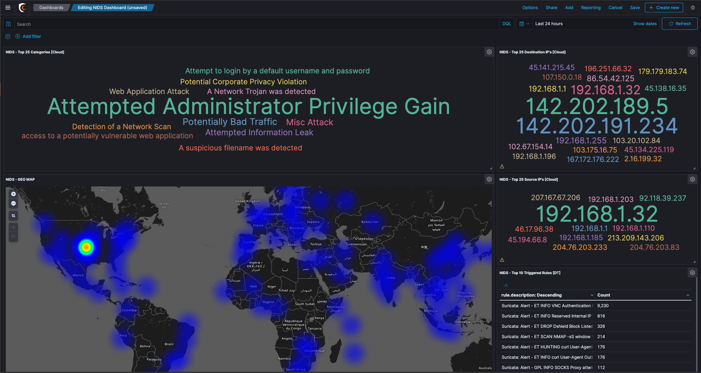
Dashboard
A Dashboard displays different visualizations and maps. Dashboard allows you to use a visualization on multiple dashboards without having you to copy the code around. Editing a visualization automatically changes every Dashboard using it. Dashboard content can also be shared.
Exercise: Creating a new Dashboard
Click Dashboard from the side navigation and Click the “+ Create Dashboard” button

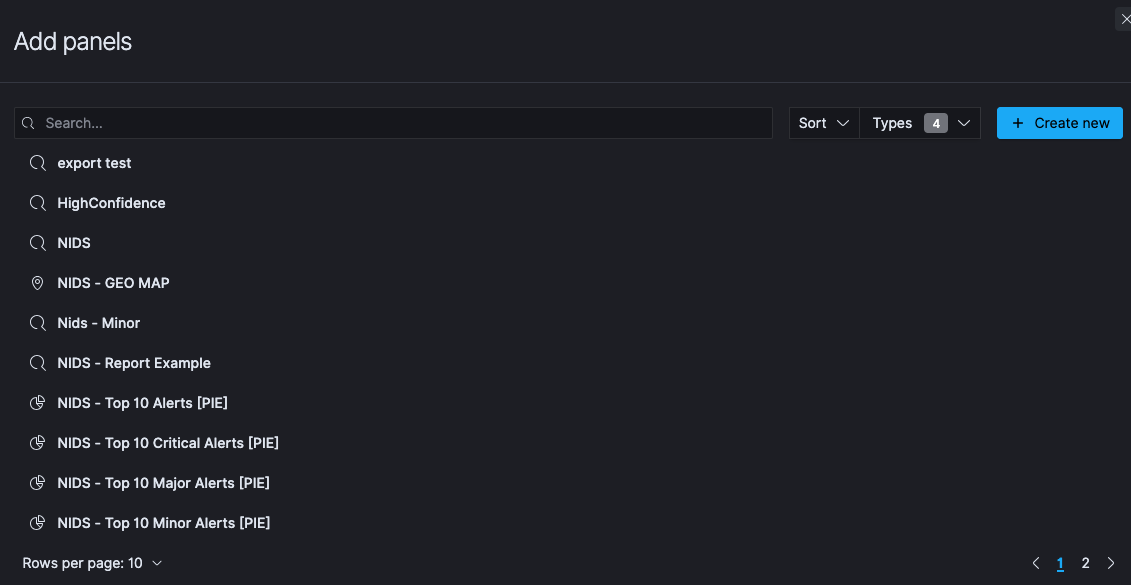
Click the Add button in the menu bar to add a visualization to the Dashboard. This will open Add Panels that will display the list of available Visualization and the Saved Searches. The list of visualizations can be filtered.

From the menu that opens, Click on all the visualizations you have created that you want to add to the dashboard
You can click on resize control option on the lower right of the panel and drag to the new dimensions to resize the panel.
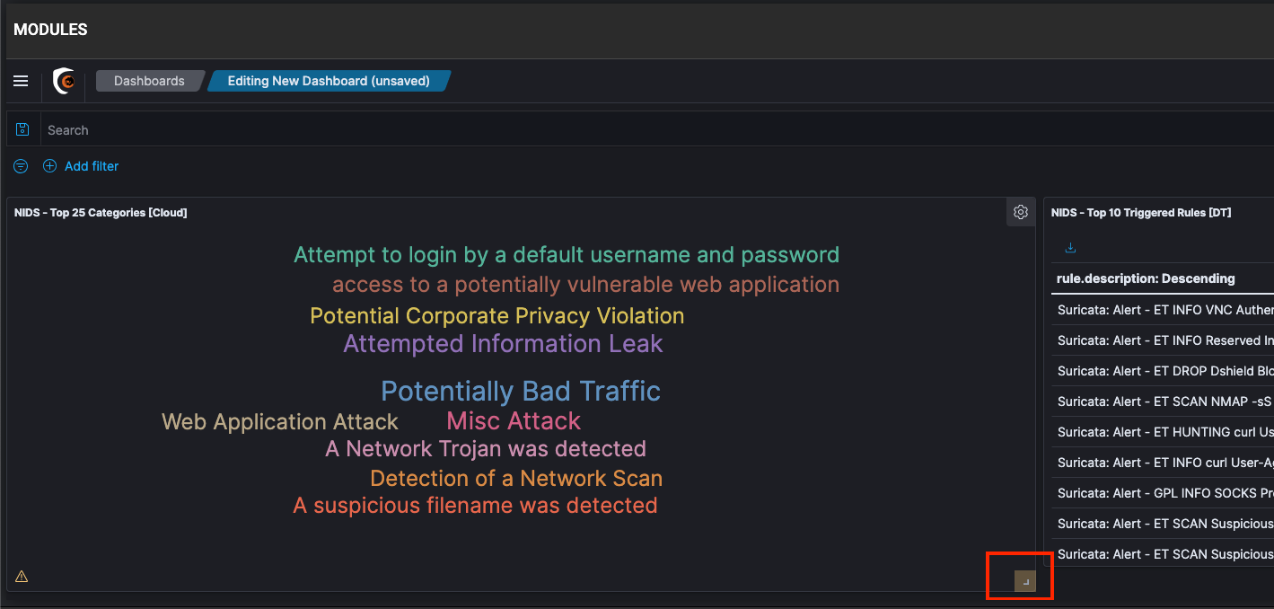
You can move these panels around by dragging them from the panel header.
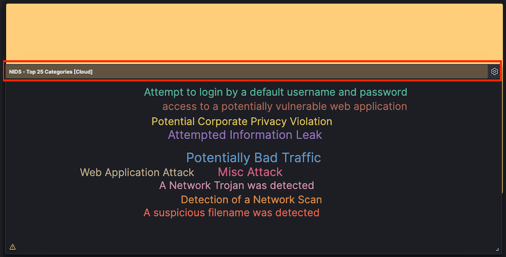
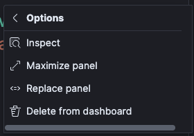
If you want to delete a panel from the dashboard, you can click on the gear icon

Click the “More” shortcut
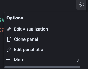
Then Click “Delete from dashboard”
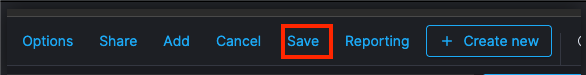
Once you have finished all the visualization, click Save button in the menu bar to save your Dashboard.
In the Save dashboard dialog box, enter the Title for the Dashboard. You can add a Description to provide some details for the Dashboard.
Enable the Store time with dashboard option. This will change the time filter of the dashboard to the currently selected time each time this dashboard is loaded. Click Confirm Save.
🔖 These saved dashboards can be viewed, edited, imported, exported, and deleted from Dashboard Management > Dashboard Management > Saved Objects from the left navigation menu. A saved object can be a Search, Visualization, Dashboard, or an Index Pattern
Anomaly Detection / Machine Learning
An anomaly is any unusual change in behavior. Anomalies in your time-series data can lead to valuable insights. For example, for IT infrastructure data, an anomaly in the memory usage metric might help you uncover early signs of a system failure.
Discovering anomalies using conventional methods such as creating visualizations and dashboards can be challenging. You can set an alert based on a static threshold, but this requires prior domain knowledge and is not adaptive to data that exhibits organic growth or seasonal behavior.
The anomaly detection feature automatically detects anomalies in your Elasticsearch data in near real-time using the Random Cut Forest (RCF) algorithm. RCF is an unsupervised machine learning algorithm that models a sketch of your incoming data stream to compute an anomaly grade and confidence score value for each incoming data point. These values are used to differentiate an anomaly from normal variations. For more information about how RCF works, see Random Cut Forests.
You can pair the anomaly detection plugin with the alerting plugin to notify you as soon as an anomaly is detected.
Getting started with anomaly detection
To get started, choose Anomaly Detection in Kibana.
Create a detector
A detector is an individual anomaly detection task. You can create multiple detectors, and all the detectors can run simultaneously, with each analyzing data from different sources.
Choose Create Detector.
Enter the Name of the detector and a brief Description. Make sure the name that you enter is unique and descriptive enough to help you to identify the purpose of this detector.
For Data source, choose the index that you want to use as the data source. You can optionally use index patterns to choose multiple indices.
Choose the Timestamp field in your index.
For Data filter, you can optionally filter the index that you chose as the data source. From the Filter type menu, choose Visual filter, and then design your filter query by selecting Fields, Operator, and Value, or choose Custom Expression and add in your own JSON filter query.
For Detector operation settings, define the Detector interval to set the time interval at which the detector collects data.
The detector aggregates the data in this interval, then feeds the aggregated result into the anomaly detection model. The shorter you set this interval, the fewer data points the detector aggregates. The anomaly detection model uses a shingling process, a technique that uses consecutive data points to create a sample for the model. This process needs a certain number of aggregated data points from contiguous intervals.
We recommend you set the detector interval based on your actual data. Too long of an interval might delay the results and too short of an interval might miss some data and also not have a sufficient number of consecutive data points for the shingle process.
To add extra processing time for data collection, specify a Window delay value. This is to tell the detector that the data is not ingested into Elasticsearch in real time but with a certain delay. Set the window delay to shift the detector interval to account for this delay.
For example, say the detector interval is 10 minutes and data is ingested into your cluster with a general delay of 1 minute. Assume the detector runs at 2:00, the detector attempts to get the last 10 minutes of data from 1:50 to 2:00, but because of the 1-minute delay, it only gets 9 minutes of data and misses the data from 1:59 to 2:00. Setting the window delay to 1 minute, shifts the interval window to 1:49 - 1:59, so the detector accounts for all 10 minutes of the detector interval time.
Choose Create.
After you create the detector, the next step is to add features to it.
Add features to your detector
In this case, a feature is the field in your index that you to check for anomalies. A detector can discover anomalies across one or more features. You must choose an aggregation method for each feature: average(), count(), sum(), min(), or max(). The aggregation method determines what constitutes an anomaly.
For example, if you choose min(), the detector focuses on finding anomalies based on the minimum values of your feature. If you choose average(), the detector finds anomalies based on the average values of your feature.
On the Features page, select Add features.
Enter the Name of the feature.
For Find anomalies based on, choose the method to find anomalies. For Field Value menu, choose the field and the aggregation method. Or choose Custom expression, and add in your own JSON aggregation query.
Preview sample anomalies and adjust the feature settings if needed.
For sample previews, the anomaly detection plugin selects a small number of data samples—for example, one data point every 30 minutes—and uses interpolation to estimate the remaining data points to approximate the actual feature data. It loads this sample dataset into the detector. The detector uses this sample dataset to generate a sample preview of anomaly results. Examine the sample preview and use it to fine-tune your feature configurations, for example, enable or disable features, to get more accurate results.
Choose Save and start detector.
Choose between automatically starting the detector (recommended) or manually starting the detector at a later time.
Observe the results
Choose the Anomaly results tab.
You will have to wait for some time to see the anomaly results.
If the detector interval is 10 minutes, the detector might take more than an hour to start, as it’s waiting for sufficient data to generate anomalies.
A shorter interval means the model passes the shingle process more quickly and starts to generate the anomaly results sooner. Use the profile detector operation to make sure you check you have sufficient data points.
If you see the detector pending in “initialization” for longer than a day, aggregate your existing data using the detector interval to check if for any missing data points. If you find a lot of missing data points from the aggregated data, consider increasing the detector interval.
The Live anomalies chart displays the live anomaly results for the last 60 intervals. For example, if the interval is set to 10, it shows the results for the last 600 minutes. This chart refreshes every 30 seconds.
The Anomaly history chart plots the anomaly grade with the corresponding measure of confidence.
The Feature breakdown graph plots the features based on the aggregation method. You can vary the date-time range of the detector.
The Anomaly occurrence table shows the Start time, End time, Data confidence, and Anomaly grade for each anomaly detected.
Anomaly grade is a number between 0 and 1 that indicates the level of severity of how anomalous a data point is. An anomaly grade of 0 represents “not an anomaly,” and a non-zero value represents the relative severity of the anomaly. The confidence score is an estimate of the probability that the reported anomaly grade matches the expected anomaly grade. Confidence increases as the model observes more data and learns the data behavior and trends. Note that confidence is distinct from model accuracy.
Set up alerts
To create a monitor to send you notifications when any anomalies are detected, choose Set up alerts. You’re redirected to the Alerting, Add monitor page.
For steps to create a monitor and set notifications based on your anomaly detector, see Monitor.
If you stop or delete a detector, make sure to delete any monitors associated with the detector.
Adjust the model
To see all the configuration settings, choose the Detector configuration tab.
To make any changes to the detector configuration, or fine tune the time interval to minimize any false positives, in the Detector configuration section, choose Edit.
You need to stop the detector to change the detector configuration. In the pop-up box, confirm that you want to stop the detector and proceed.
To enable or disable features, in the Features section, choose Edit and adjust the feature settings as needed. After you make your changes, choose Save and start detector.
Choose between automatically starting the detector (recommended) or manually starting the detector at a later time.
Manage your detectors
Go to the Detector details page to change or delete your detectors.
To make changes to your detector, choose the detector name to open the detector details page.
Choose Actions, and then choose Edit detector.
You need to stop the detector to change the detector configuration. In the pop-up box, confirm that you want to stop the detector and proceed.
After making your changes, choose Save changes.
To delete your detector, choose Actions, and then choose Delete detector.
In the pop-up box, type delete to confirm and choose Delete.
Index Management
If you analyze time-series data, you likely prioritize new data over old data. You might periodically perform certain operations on older indices, such as reducing replica count or deleting them.
Index State Management (ISM) is a plugin that lets you automate these periodic, administrative operations by triggering them based on changes in the index age, index size, or number of documents. Using the ISM plugin, you can define policies that automatically handle index rollovers or deletions to fit your use case.
For example, you can define a policy that moves your index into a read_only state after 30 days and then deletes it after a set period of 90 days. You can also set up the policy to send you a notification message when the index is deleted.
You might want to perform an index rollover after a certain amount of time or run a force_merge operation on an index during off-peak hours to improve search performance during peak hours.
To use the ISM plugin, your user role needs to be mapped to the all_access role that gives you full access to the cluster. To learn more, see Users and roles.
Get started with ISM
To get started, choose Index Management in Kibana.
Step 1: Set up policies
A policy is a set of rules that describes how an index should be managed. For information about creating a policy, see Policies.
Choose the Index Policies tab.
Choose Create policy.
In the Name policy section, enter a policy ID.
In the Define policy section, enter your policy.
Choose Create.
After you create a policy, your next step is to attach this policy to an index or indices. You can also include the policy_id in an index template so when an index is created that matches the index template pattern, the index will have the policy attached to it.
Step 2: Attach policies to indices
Choose Indices.
Choose the index or indices that you want to attach your policy to.
Choose Apply policy.
From the Policy ID menu, choose the policy that you created. You can see a preview of your policy.
If your policy includes a rollover operation, specify a rollover alias. Make sure that the alias that you enter already exists. For more information about the rollover operation, see rollover.
Choose Apply.
After you attach a policy to an index, ISM creates a job that runs every 5 minutes by default to perform policy actions, check conditions, and transition the index into different states. To change the default time interval for this job, see Settings.
If you want to use an Elasticsearch operation to create an index with a policy already attached to it, see create index.
Step 3: Manage indices
Choose Managed Indices.
To change your policy, see Change Policy.
To attach a rollover alias to your index, select your policy and choose Add rollover alias. Make sure that the alias that you enter already exists. For more information about the rollover operation, see rollover.
To remove a policy, choose your policy, and then choose Remove policy.
To retry a policy, choose your policy, and then choose Retry policy.
For information about managing your policies, see Managed Indices.
For more indepth documentation on index management, please refer to the official OpenDistro documentation that can be found at the following URL:
https://opendistro.github.io/for-elasticsearch-docs/docs/ism/